In case you missed Part I of our kitchen renovation saga be sure and check it out before we dive into the design of our new kitchen.
Even after closing in the door to our bedroom, and removing the millwork on the oven wall, we still had a hard time figuring out how we really wanted our kitchen to flow. We didn't want to create any major movements to help keep the budget down, but were open to relocating things like gas, waterlines, etc.
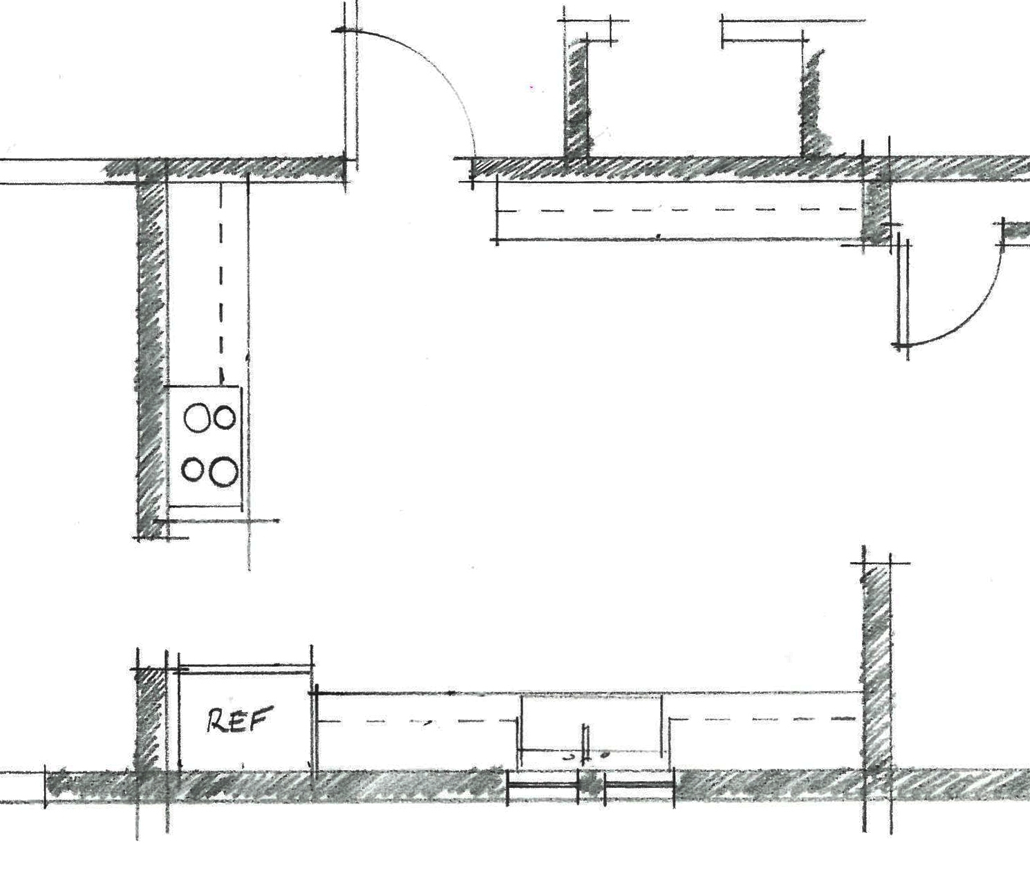
Here is what the floor plan looked like when we first moved in, to help give a better idea of what we were working with.
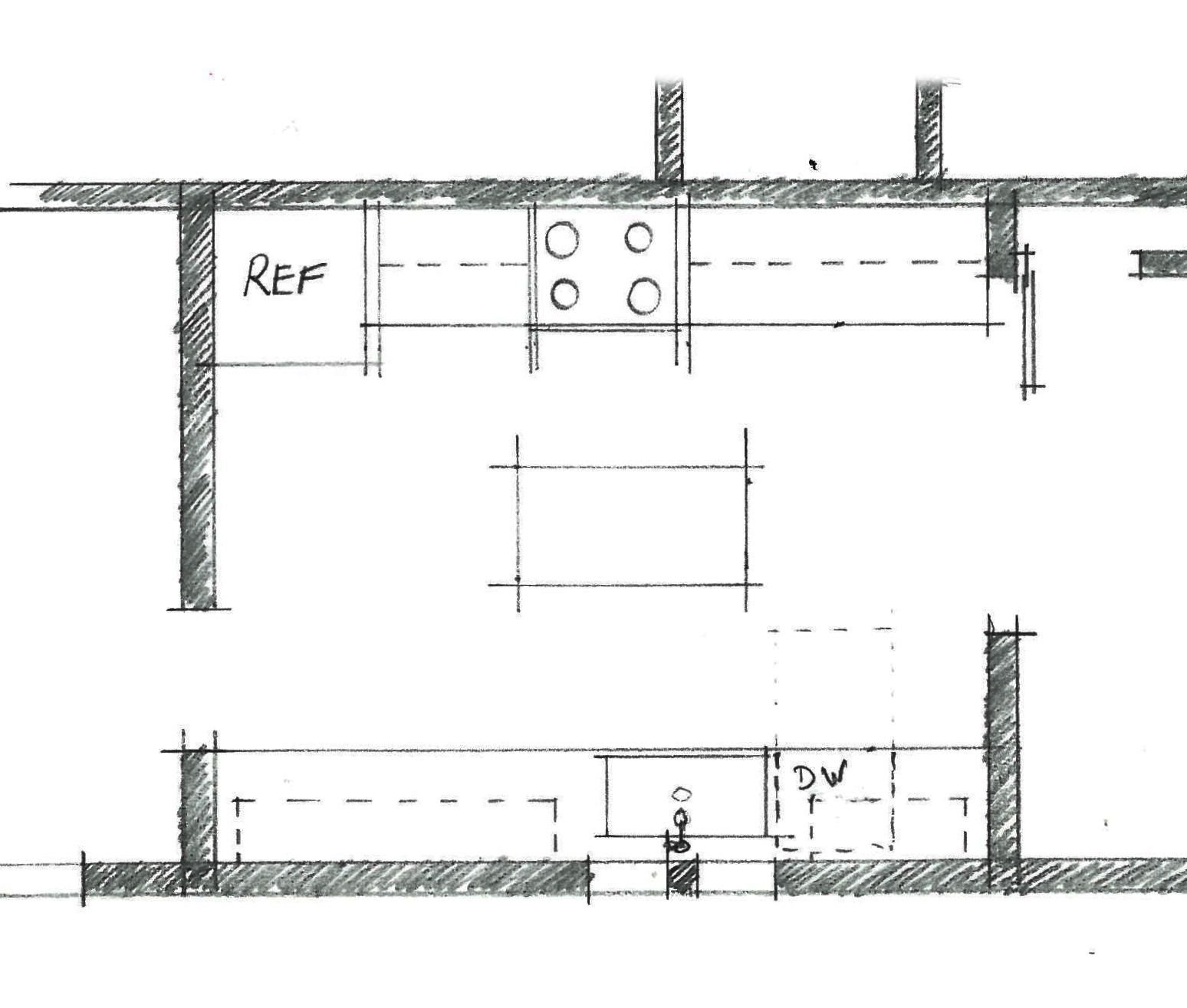
Then this is how we had it laid out after closing in the door to our bedroom and removing the millwork on the existing oven wall.
For the longest time Derek only wanted to partially renovate the kitchen, while I was 100% for a full renovation. So we thought about adding an L-shape lower cabinet between the new stove and fridge but L-shape cabinets kind of drive us crazy. They are super deep and its hard to reach things in the way back corner. Plus in our situation it would have to be a very tight L-shape lower which made it even more awkward. I also didn't love how the edge of the stove would be exposed, it all just felt like a big bandaid. So we stewed over several different sketches until Derek finally yeilded and agreed that a full renovation was the only way to have a successful kitchen, and we landed on this.
The overall concept is an oversized galley kitchen with an island in the middle. It was a simple choice, while also solving all of our problems. No awkward cabinets, a clean flow, and minimal demolition. You're probably wondering why we didn't remove that wall that separates the kitchen from the living room (on the left). Honestly, because the laundry room / breakfast nook also had a wide opening, and we didn't want to see all the way down the house when you first walked into the front door. We wanted to create a separate space. Also, there was a lot of electrical we would have had to relocate and a floor material (and level) change, and it just didn't seem worth it. If this was our "forever" house we probably would have made much bigger moves like that.
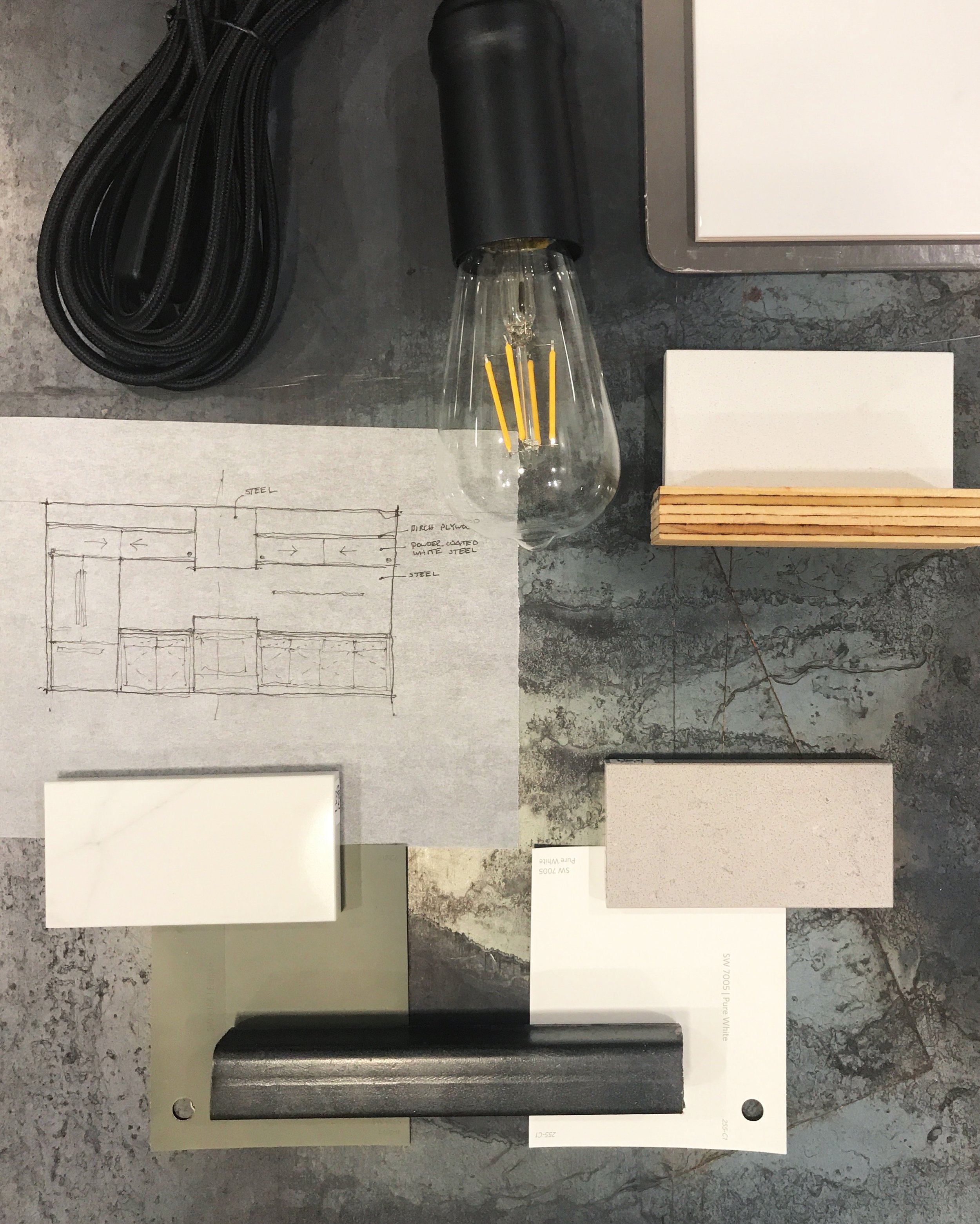
We put together two finish palettes knowing that our main design elements would be steel, our white hexagon floors, gunmetal appliances, black fixtures / hardware, and plywood. I loved the idea of olive green shaker cabinets with a carerra style quartz countertop, while Derek preferred white shaker cabinets with a matte concrete style quartz. We took a poll and (most) everyone loved the olive route which we would have probably ended up doing even if everyone picked white ha. I just didn't love the idea of having white cabinets against our white floors.
We decided that all of the lower cabinets would be shaker style doors and drawers painted Eclipse by Sherwin Williams with these matte black linear pulls and white carrera style quartz countertops with a 3cm square edge.
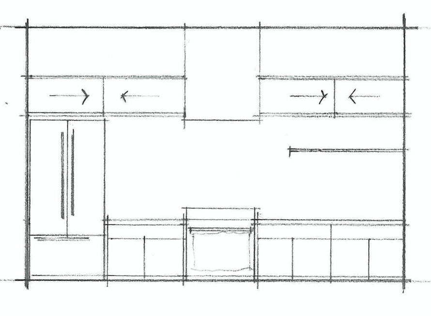
As the floor plan indicated, the oven and fridge would be on one side of the kitchen. There will be a hot rolled sheet steel backsplash and thin steel shelf for spices and grains. We loved the idea of steel because it ties in with the other steel elements throughout our home, and it's also magnetic which is kind of fun for recipes, hooks, etc. The vent hood will be wrapped in plywood with two plywood upper cabinets on either side, each with sliding gloss white doors. We felt like this helped to ground everything and make the fridge and oven feel more built in.
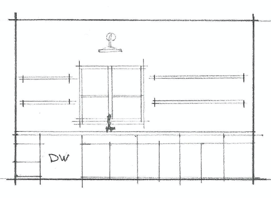
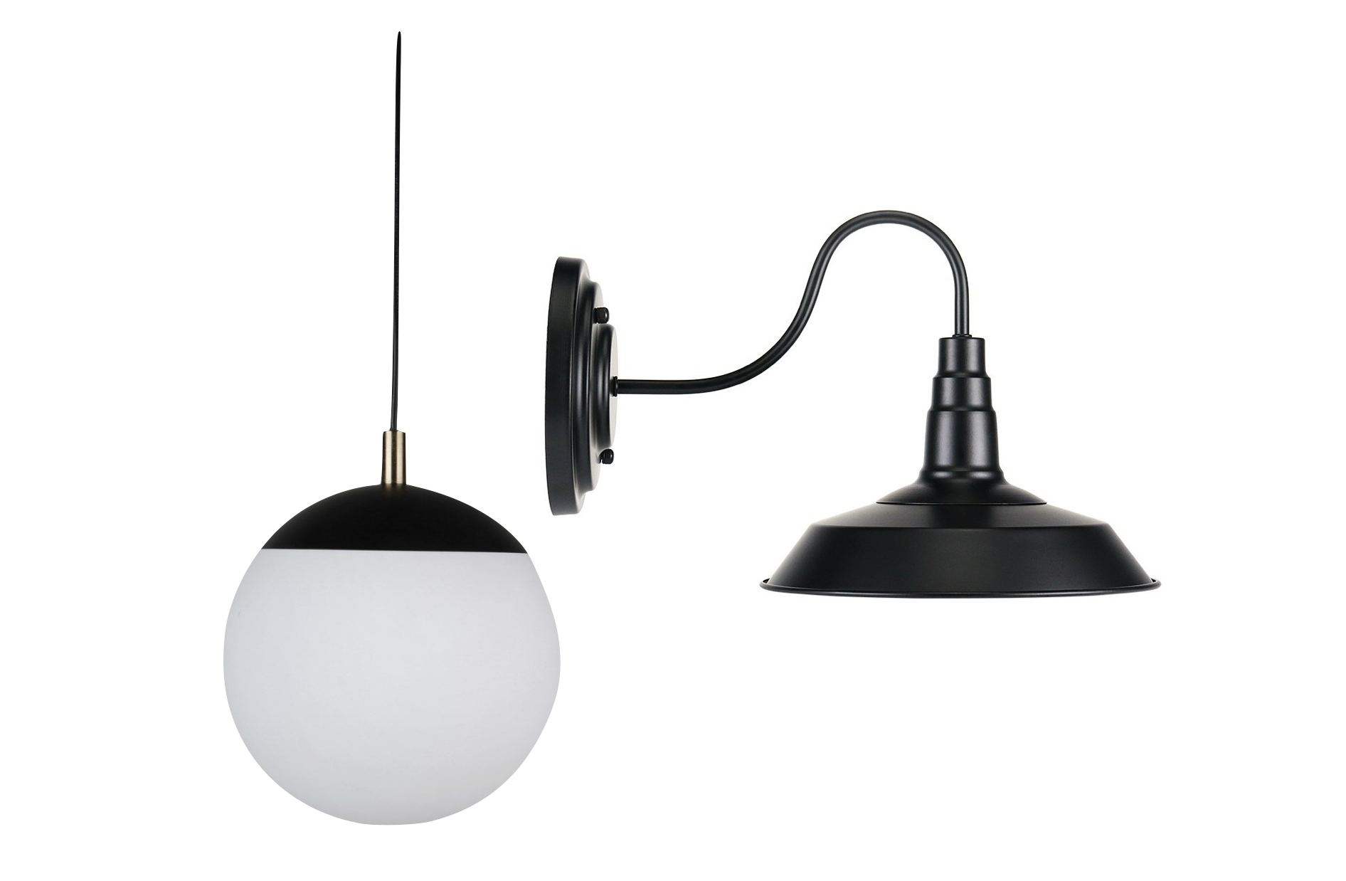
The opposite side of the kitchen will have a matte white ceramic tile backsplash, to help offset the darkness of the steel. There will be plywood floating shelves on hidden steel brackets on either side of the window, with a black barn light above. We will located the dishwasher (eek!) to the left of the sink in the same gunmetal finish as our fridge and stove. The sink will be nice and deep and under-mounted with a matte black faucet.
Between both sides of the kitchen will be our antique drafting table that will be used as an island, allowing for more prep area, with two matte black and milk glass globe pendants hanging above.
For the lighting we wanted everything to be black to pop against the white, while also tying into the color of the steel.
We plan to order all of the lower cabinets, while Derek makes all of the uppers and the vent hood wrap. We just love how all of the elements reflect the craftsman style of our home with modern industrial elements like the steel and plywood. Yet everything ties together so nicely and reflects our overall style without looking too trendy.
Stay tuned for Part III of our kitchen renovation saga where I'll share how we replaced our one boob light with snap in can lights. You can't demo without great lighting!

